This focus on the book cover redesign is to emphasize the typography, as it should serve to be the main focus of the design itself.
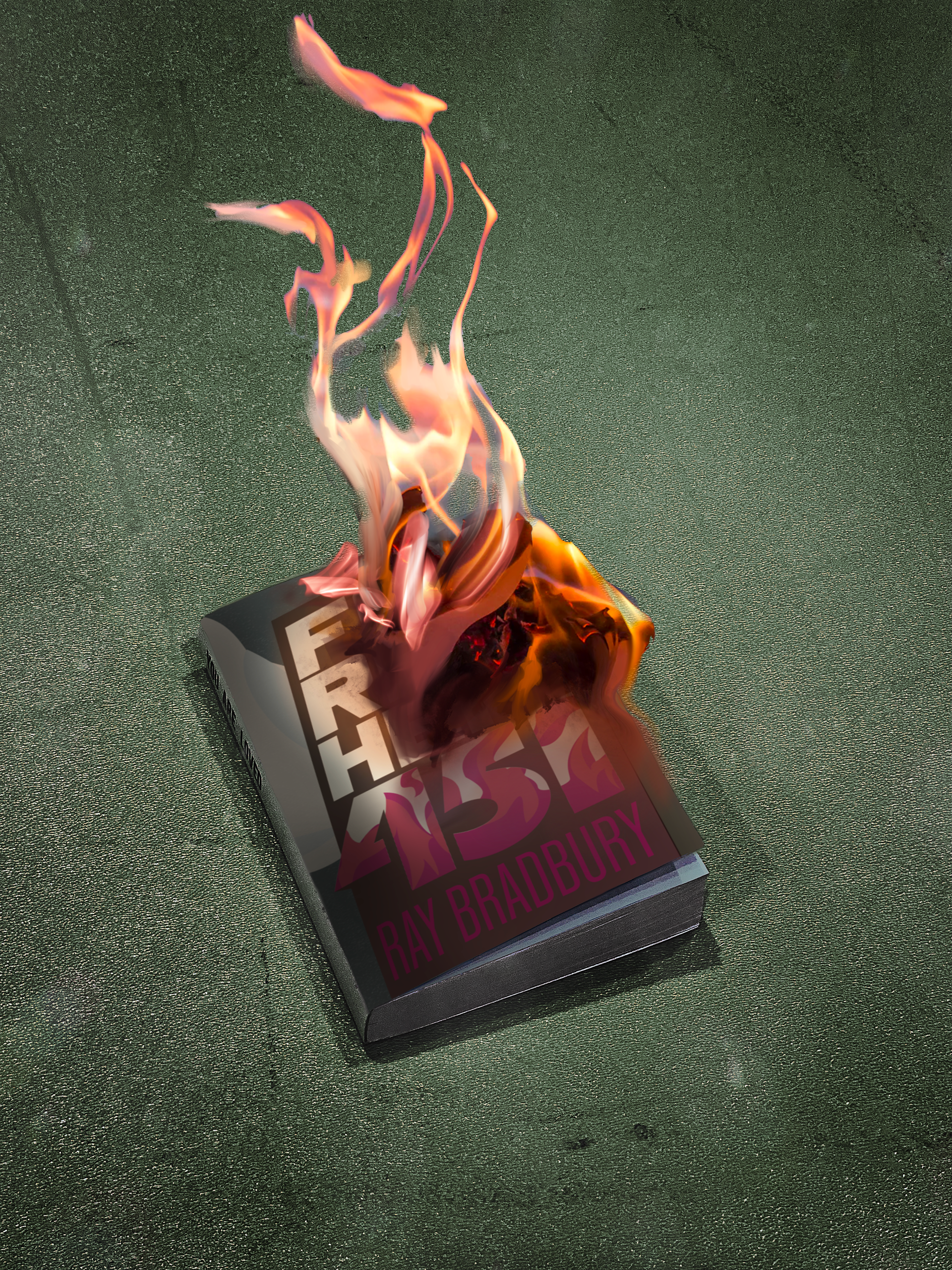
One of the reasons that I chose to redesign the book Fahrenheit 451 was because it was a very compelling book, set in a dystopian era where books as a source of knowledge was outlawed and to be outright burned. Immediately my mind envisioned various wartime graphics that were being produced and distributed throughout the late 1930-1940s, with some inspiration from different kinds of propaganda posters using dull, dark, muddy themes but also using bright colors such as red to emphasize and contrast with the blending colors.
I represent the title of the book as a tall skyscraper, that also sees itself as a book that is caught on fire within the text of 451, as it is mentioned in the novel "451 is the temperature at which book paper spontaneously catches fire and burns". As the title burns away, it leaves a trail of smoke that leads to the left, in which I design it in a way to incorporate information about the book as well as a little biography of the author, Ray Bradbury.